Tuesday 16 April 2013

MS2 EVALUATION: Word count 1583

DVD Cover
My DVD Cover conveys the codes and conventions of the film through the colours as they show the film has ‘dark ‘aspects, e.g. domestic violence and the mode of address of the protagonist hints at a psychological aspect to the film. The front image also attracts attention as an enigma of mystery.The typography used is effective as it hints at a teenage girl ‘doodling’, and it also hints at a child using a crayon, which hints at the film genre. Placing the actresses' names at the top of the cover shows they are the main protagonists. By writing my own billing block  I made the cover look unique and professional.Using the same typography for the synopsis/tagline/actors names helps the cover to link together.

However there are parts that I could improve on such as the front image could be a little clearer as it does look blurry at the top of the picture. The image also looks slightly ‘squashed’. The actors names don’t really look that eye catching as the colour blends in with the background. The front cover looks too plain/simple which hints at a different genre e.g. horror, due to the colours used.   
Teaser Poster 


My poster is effective because the colours work well together as they make the protagonist look young and brings realist into the image. Placing the tagline at the top of the poster helps to bring out the meaning behind it through the lighting on the words.  The typography for the title hints at the protagonist being ‘childlike’, which works with the image. The layout also works well because it doesn't overwhelm the audience with the information. Using the logos gives the poster an ‘official look’.

Nevertheless I could change the size of the poster, to make the image more eye-catching. I would also add more detail to show the codes and conventions more e.g. two contrasting images to hint at the plot of the film. Moving the typography closer together would help to change the overall effect of the poster, especially the title as the image is cover slightly by the typography. 

Looking back over my work I noticed there are details I would change.  The DVD cover could look more unique, e.g. using a different background layout.  I could have also conveyed the codes and conventions more through my DVD cover, such as using brighter colours.  For my teaser poster I would change the background so that the picture isn't as bold and the image reveals more to the audience. 


Next time I will try to organise myself more and divide my time out so that I have set time limits to work on each part of the coursework to enhance the ‘sell-ability’ of my production pieces.

Overall I feel that I have worked to the best of my ability and it is reflected in the quality of my work and my production pieces work well together through the design layout as they both look official and convey the codes and conventions of my film genre clearly. 

Thursday 21 March 2013

MS2 EVALUATION: Comparison Products

When reviewing my production pieces, I compared my DVD cover and poster to other films from the true story genre. Using the films mentioned above I found my DVD cover didn’t really match theirs; however using this website http://www.filmcrave.com/list_genre_movie.php?genre=Fantasy&page=1 I researched fantasy-drama films, and found two that I could use as comparisons, shown below. 


I can compare the Butterfly Effect to my DVD cover because the facial expression of the protagonist is grim and the indirect mode of address adds an enigma of mystery. Also the white lighting used around the protagonist is similar to my DVD Cover. Another comparison is that the background colour is used all over the DVD cover, which is a feature of my DVD cover, and the colour is also black on both products. 


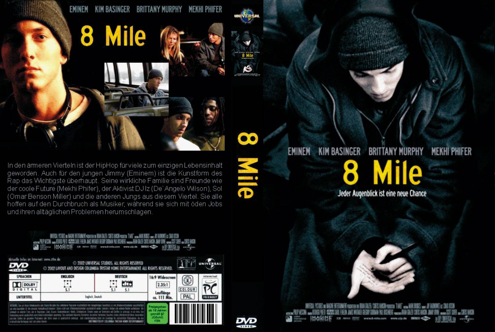
Another comparison is ‘8 mile’, as it’s a true story and reflects my plot-line by showing that whatever life throws at you, you can overcome it. The protagonist’s mode of address shadows mine, as they both look down at their hands.  The background colour is similar as it uses shadows/lighting to highlight the protagonists face.  

Sunday 17 March 2013

MS2 EVALUATION: Research

When looking at true story films, I looked at the target audience for ‘The Lovely Bones’, which is mainly the female population, ages 13-20+. It would also target crime/mystery lovers, true movie fans and fans of the original book.


Using the website http://www.barb.co.uk I found that ‘Call the Midwife’ had a ratings of 10.18 million viewers on 30th December 2012 and 10.85 million viewers on the 3rd February 2013. This shows there’s a huge audience out there that enjoy watching films/TV programmes based on real life. This research helps with my marketing campaign as it shows that I need to persuade a wide audience range to see my film.I also found the last ‘Buffy the Vampire Slayer’ rating was 42,000 viewers on 28th March 2010, which again shows there is   a wide audience range.
Questionnaires for my focus group


I undertook primary research through a focus group by asking them questions about my idea, noted down their answers and adapted my work towards their responses. From this I decided to target my film towards the female population aged 12 +. Using the website http://www.bbfc.co.uk/what-classification/12a-and-12 I looked at the requirements of the 12 age rating. I kept this age rating as it allows me to retain most of the real story, without offending the audience. 

As my film covers a range of genres, it will appeal to the general population. My primary target audience is the female population aged between 12-30 years old, as the protagonist is shown through the stages of her life as she grows up, and true movie fans as this is a different type of true story. My secondary target audience would be fantasy-drama lovers (mentioned above), and would appeal to them through the concepts of the film. 


I went on the look at audience demographics. Using; http://www.howtodothings.com/business/a3607-how-to-identify-a-target-market.html helped me to justify my target audience clearly. Everyone in the world is categorised into a ‘class’ which are:  upper class, who are the very rich e.g. The Queen, middle class who have enough money to live a luxurious life style e.g. Manager, and working class, who are average/everyday, people e.g. shop assistants. Due to this their incomes are considerably different which would affect my target audience of my film.  My target audience involves the working class more as they would understand the plot line more and are more likely to have gone through something similar/ know someone who has. I’m going to target mainly the female population, as the film is female based, aged between 12-30. This is my primary audience. I also looked at the psychographics for my film.The personality of the audience is significant as the more ‘timid’/shy person is more likely to watch my film than a ‘bold’/outgoing person. The interests/hobbies of the audience is significant as not everyone likes true story movies.

Knowing  target audience, I researched audience theories. The one that applies to my work is the uses and gratification theory because it reflects my work and it shows how an audience relates to what they see, which is how I want my target audience to react to my film.

Tuesday 12 March 2013

MS2 COURSEWORK: Introduction and Research

My coursework project required to come up with a film idea and make it come to life. I decided to create a script for my pre-production and a teaser poster and a DVD cover for my production tasks. I chose this option because through my practice task, I enjoyed experimenting with the dialogue, which lets me be more creative.


My film idea has a range of genres combined into one plot. The main genre is true story, which means that it is non-fiction and factual. I chose this genre as a friend of mine had an unpleasant childhood and I wanted to show how, not everyone has the ‘perfect life’ and how they deal with these imperfections. To ensure anonymity, I altered the characters names and situations so more people could relate to the idea. As this story is close to my heart I studied the codes and conventions of the genre, to ensure my information was correct, shown opposite.

Using http://www.filmsite.org/subgenres2.html I looked at other genre types and chose fantasy-drama as they interlink with my main genre. The fantasy part interlinks as the protagonist has a fantasy world that she uses as an escape from the harshness of reality. The drama links in through the storyline, due to the domestic abuse/psychological references.

I conducted secondary research on the main genre by looking at true films such as 'The Blind Side’, 'Titanic', and 'The Lovely Bones'. I analysed film posters to get a better understanding of what my poster should convey, e.g. images/ typography. Creating a mood board of the film posters/ DVD covers helped me to compare/ contrast the colours/ layouts/ typography used. (images below). I also used: http://www.imdb.com/list/2xHGLzvIkzA/ and http://www.rottentomatoes.com/ to study the types of non-fiction films to get a better understanding of story lines and to see how audiences rated certain films e.g. The Lovely Bones.  


Titanic DVD Cover analysis 
The Lovely Bones DVD Cover analysis
The Blind Side DVD Cover analysis 
The Blind Side Poster analysis 
The Lovely Bones poster analysis 
Titanic Poster analysis
Mood Board


Researching my sub-genre on http://media.edusites.co.uk  helped me understand the codes and conventions, shown opposite. I also looked at types of fantasy-drama T.V. Series to help me construct my characters e.g. Buffy the Vampire Slayer. 

Researching my sub-genre on http://media.edusites.co.uk helped me understand the codes and conventions, shown opposite. I also looked at types of fantasy-drama T.V. Series to help me construct my characters e.g. Buffy the Vampire Slayer. 


For script assistance I studied different types of scripts (websites below) and used Google to look at different types of script layouts. Relating back to my practice task also gave me inspiration.